


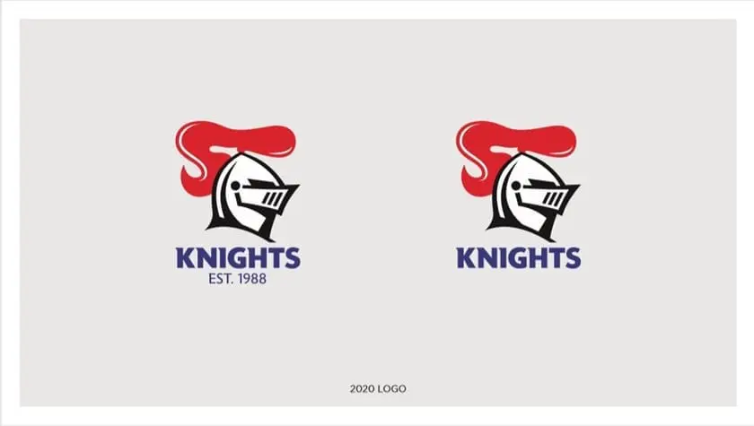
The Newcastle Knights have unveiled a new logo for 2020.
The update was required following changes to National Rugby League Branding Guideline, with only subtle adjustments to their current design.
The changes came in to give the all NRL logos a cleaner look with the addition of new visual elements.
New Knights logo
Newcastle revealed the new logo via a social media video, including former greats and current players discussing the club's values and paying respect to their past.
New direction as Knights face forward!
📝 https://t.co/AR81GWPI1E#NRL #GoHardGoKnights pic.twitter.com/uKRLmQuhEf
— Newcastle Knights (@NRLKnights) September 19, 2019
The club released the following statement on its official website regarding the new logo.
"We understand the history and deep significance that sits behind our club brand and logo, and we have worked hard to ensure this is respected in the new design.
"Core elements – the Knights head, name, and club colours – have all been retained.
"But symbolic changes have also been made.
"From 2020 onwards, the Knights head will face in the opposite direction, looking forward into a bright future.
"The club’s origin story is also now front and centre, with the addition of Est. 1988 into the design for the first time.
"These changes, along with the retention of the elements that make the brand iconic, allow the brand and logo to be modernised while ensuring our proud history remains undiminished."


It’s totally unrecognizable. The transition will be very confusing and frustrating for the fans.
For a while they won’t know who they’re supporting.
the old one looks better,
Still, you know it’s Newcastle, the red Mullet
wow. what a waste of time
How do they know its facing forward? It used to face to the left, now its facing to the right? LOL.
I agree chookstir, old logo still looks best.
As someone who recently moved south of the border and now lives in Newy, I can tell you absolutely no one is talking about this.
Absolutely riveting story. This is just the type thing the Knights need to send them skyrocketing up the table. What a wate of space and will Newcastle supporters give two hoots!!!
Old logo is better with the medieval font